Over 15 years of partnership with Unilever across CIS markets.
projects
brands
food and non-food categories
the beginning of our partnership with local and global teams
A global brand arrives with recognition. But recognition still has to earn attention at the shelf, make sense within a local category, and give people a reason to choose.
That is where a long-term partnership proves its value. Since 2011, Mildberry has worked with Unilever across CIS markets on packaging, local adaptation, portfolio development, and original launch concepts. Across more than 200 projects, we have worked with more than 20 brands in drinks, food, personal care, and other categories. The briefs changed. The underlying challenge did not: make global brand equity work harder under local conditions.
Unilever operates at a scale that makes this challenge more complex. Its products are sold in 190 countries and used by 3.7 billion people every day. A system of that size depends on consistency—but it must also remain meaningful wherever a purchase decision is made.
This kind of work also requires the ability to operate between local teams and global headquarters. We help teams build the case for solutions that respond to local market realities while remaining true to the wider brand system—aligning stakeholders, clarifying the rationale, and helping the strongest ideas move forward.
Working across the Unilever portfolio calls for a particular kind of range. Every category has its own buying habits, visual codes, retail realities, and reasons to choose. It requires broad FMCG expertise: an understanding of how products earn attention, build preference, and work together within a portfolio.
A global system brings discipline: heritage, recognition, and rules that protect consistency across markets. But consistency does not guarantee effectiveness at the shelf. Local conditions change the meaning of premium, the role of gifting, the logic of navigation, and the cues that make a product easy to choose.
The work is not localization for its own sake. It is making a global brand more effective where the purchase actually happens.
The point is not to make a global brand look local. The point is to make it work locally without losing what makes it valuable.
Lipton is one of the world’s most widely recognized tea brands. Its history dates back to 1871, and its teas are sold in more than 150 countries. That reach makes consistency essential—but so is the ability to remain relevant across markets, occasions, and consumer expectations.
Lipton shows the breadth of the partnership between Unilever and Mildberry especially clearly. Over the years, we worked across core ranges, premium collections, seasonal editions, and gift formats—different briefs, different moods, one recognizable brand system.
At one end was portfolio complexity. For Lipton Pyramids, we redesigned packaging for a premium fruit and herbal tea range spanning more than 20 black and green tea blends. The task was to bring order to complexity: make a broad assortment more appetizing, more premium, and easier to navigate. The redesign moved everyday tea closer to a richer, dessert-like ritual while keeping the range clear.
At the other were more expressive collections, where packaging carried the idea. We turned tea into a journey through tea-growing regions in the Lipton Discovery collection, where six blends from renowned plantations became destinations in their own right. We drew on European winter architecture and tea traditions in the Lipton Winter Collection, creating six house-shaped flavor modules within a transformable gift box. We turned tea tins into collectible ornaments for Lipton New Year, each part of an illustrated journey through cities around the world. We brought ballet, opera, and masquerade to the pack in the Stage Magic series. And we gave the Lipton Spring Collection a life beyond tea, with a lace-cut metal canister designed to become a candleholder.
Across these projects, the occasion was not a decorative layer. It shaped the product, the packaging, and the reason to choose it. A global brand can take many forms without losing its coherence—provided the system beneath them remains clear.
One global system. Many reasons to choose.

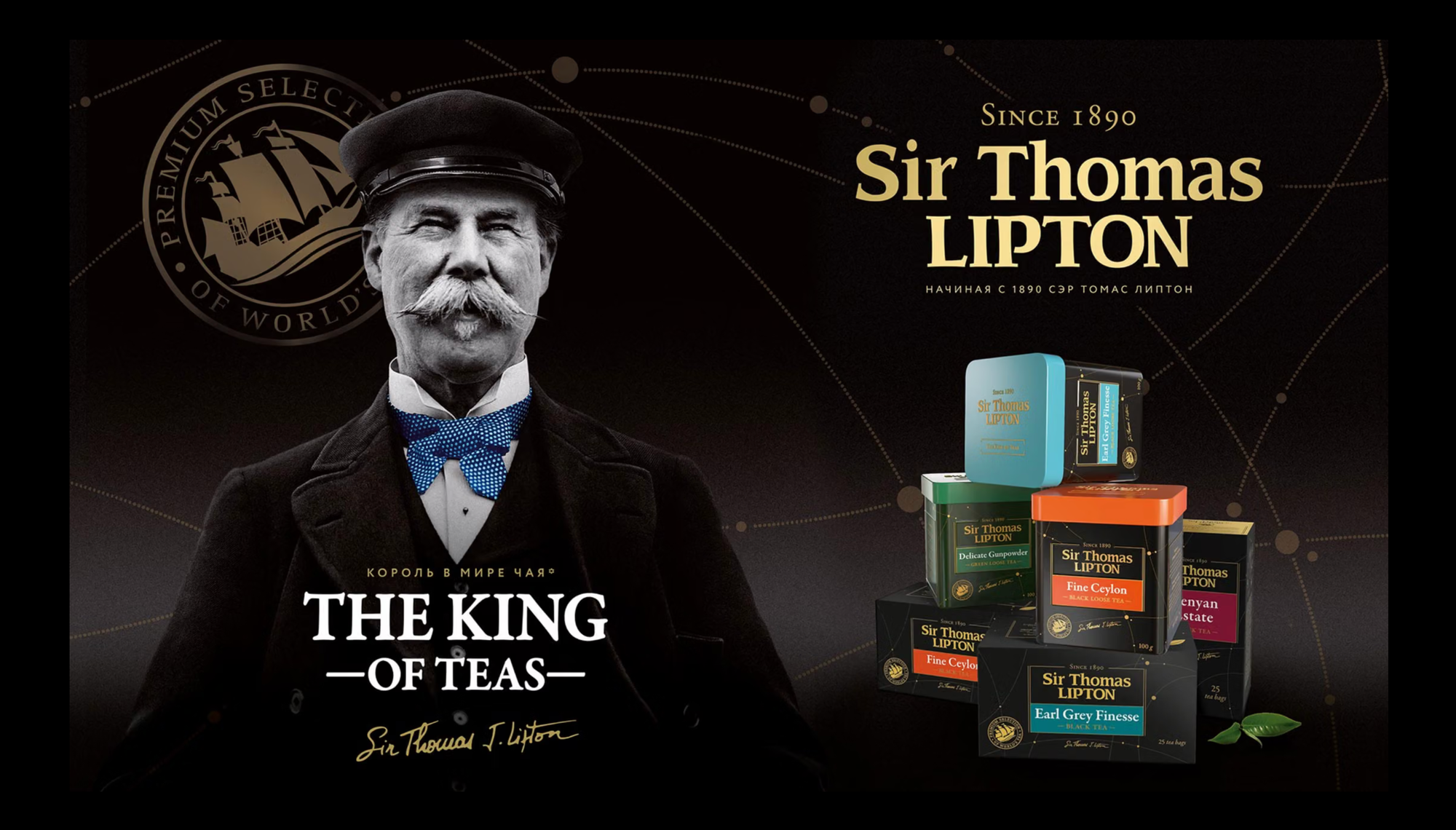
The Sir Thomas Lipton launch reveals something more specific about the relationship. Unilever came with a defined assignment: adapt an existing global design for a premium collection. But adaptation alone was unlikely to produce the strongest premium proposition for the local market.
Alongside the requested route, we developed another. Built around Sir Thomas Lipton’s 1890 journey to Ceylon, it reframed the range as a story of travel, origin, and English tea heritage rather than simply a premium dark format. We rethought the line architecture, developed new flavor naming and copy, and created a visual system that preserved the brand’s core assets while giving the collection a more distinctive premium role.
Unilever chose the concept that went beyond the original brief. That is one of the clearest advantages of a long partnership: not only the ability to execute accurately, but the confidence to recognize when a brief can be improved—and the trust required to argue for it.
Trust matters most when the best solution is not the one originally requested.
During our collaboration, Unilever’s ice cream portfolio was the world’s largest, generating €8.3 billion in annual turnover and spanning 80 countries. It included five of the ten best-selling ice cream brands globally, among them Magnum, Cornetto, Wall’s, and Ben & Jerry’s.
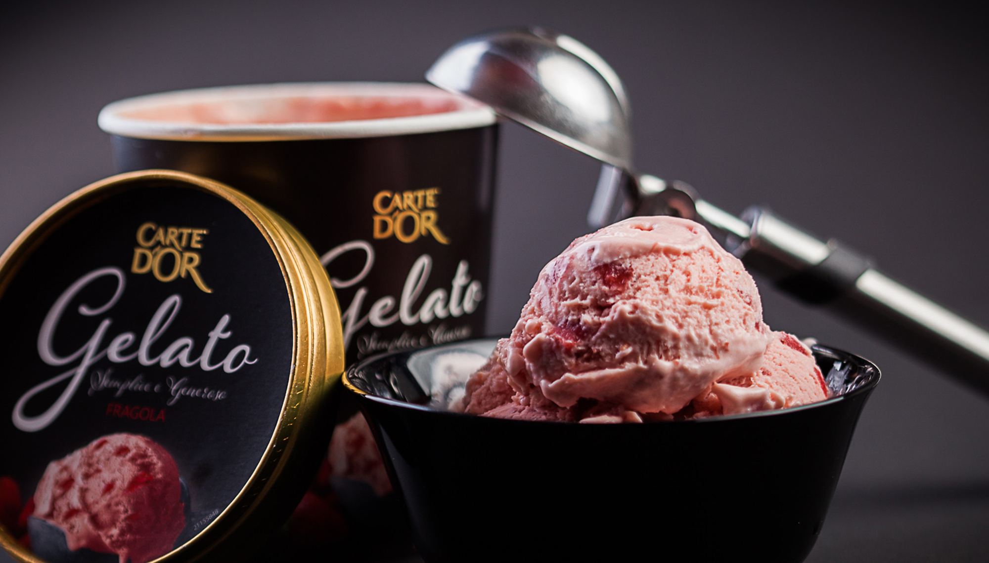
Ice cream demands a different pace. In this category, decisions are quick, emotional, and highly visual. Packaging has to signal mood, appetite, and occasion almost immediately. Across brands, the design task changed. The commercial principle did not: make the product feel right for the moment in which it is chosen. That meant working across a broad emotional register. For example, in the case of Carte D’Or, we turned premium ice cream into a gift-worthy choice for Christmas, New Year, Valentine’s Day, and International Women’s Day. For Magnat Kisses, we shifted from the darker indulgence of the core brand toward something lighter, more romantic, and more playful—opening the line to a younger audience without compromising its premium standing.
From seasonal gifting to spontaneous romance, the solutions changed with the occasion. Each gave the product a more specific role in the consumer’s moment of choice: not simply ice cream, but a small expression of celebration, affection, or indulgence.
The 2018 FIFA World Cup turned Russia into a shared stage for 32 national teams, 64 matches, and millions of fans across 11 host cities. For Cornetto, the tournament was an opportunity to speak the language of collective excitement. We created a limited-edition range that linked flavors to iconic footballing nations and used fan imagery to bring the atmosphere of the stands into the freezer aisle.
The work extended beyond packaging. A branded city map, distributed through key retail channels, brought together local routes, summer activities, and Cornetto moments across the host cities. The product became part of the season’s wider cultural landscape—not simply a World Cup-themed pack.
One summer when ice cream became part of the host-city experience.

teams
matches
cities
Personal Care is one of Unilever’s largest and most strategically important businesses. In 2025, the category generated €13.2 billion in turnover—26% of Unilever’s total sales—and delivered 4.7% underlying sales growth. It spans deodorants, skin cleansing, and oral care: categories in which everyday habits, identity, and self-presentation meet at scale.
That scale makes precision especially important. Personal care brands are chosen frequently and are closely tied to everyday routines, confidence, and how people present themselves to others. The same category cannot therefore speak credibly to every audience in the same way.
For Timotei Men, we redesigned the shampoo line for two audiences at once: male users and women buying on their behalf. The packaging was rebuilt around masculine codes—strength, directness, clarity—while staying accessible and easy to read on shelf.
Rexona required the opposite move. The brief was to speak to Generation Z: an audience less persuaded by standard functional promises and more responsive to authenticity, self-expression, and a recognizable lifestyle language. We moved away from familiar deodorant conventions and built a fresher, more social-ready aesthetic that treated the pack as part of personal identity rather than as a functional necessity.
The visual outcomes were different. The discipline behind them was the same: understand who is choosing, what the category means to them, and which codes feel native enough to be believed.
More than 15 years of collaboration have built practical knowledge and a shared understanding of what a global brand cannot lose, what a local market will not forgive, and where a new idea can strengthen the whole rather than compete with it.
That is what this partnership with Unilever has produced across tea, ice cream, sauces, and personal care: not a sequence of isolated assignments, but a body of work shaped by continuity, trust, and the ability to approach each new brief with a fuller understanding of both the brand and the market it enters.