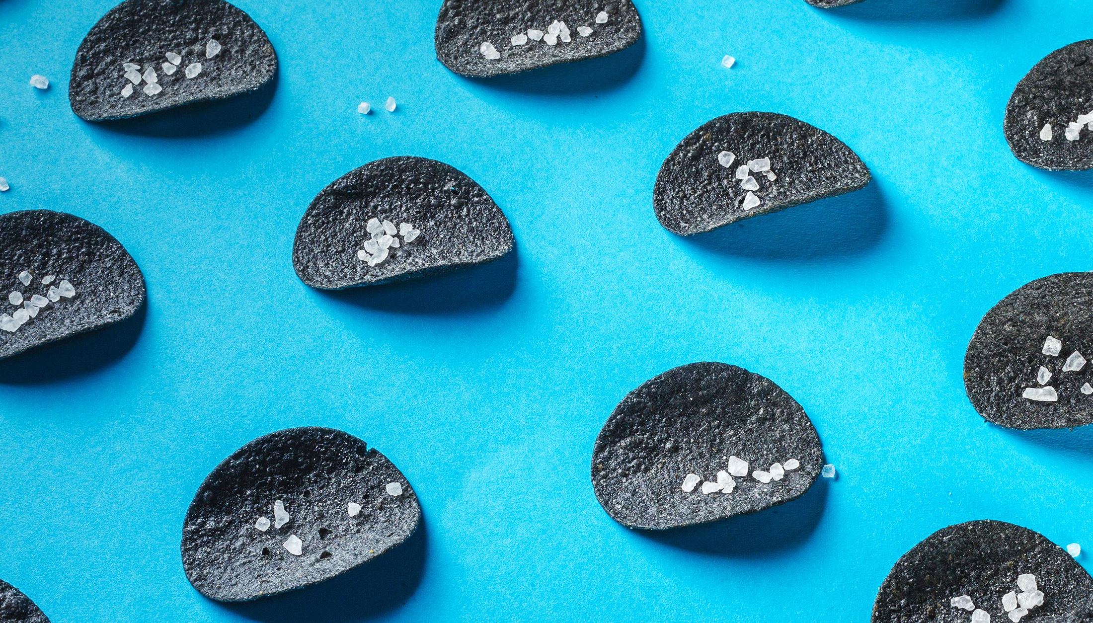
Creating a vibrant brand, strategy, and packaging design for an innovative potato chip line.
Winning consumer attention in a mature salty snack market requires moving beyond standard flavor experiments.
In the highly competitive world of potato chips, brands typically fight for shelf space through seasonal flavors, health-conscious claims, or minor shape variations. Standard market communication remains heavily dominated by conventional teenage tropes, casual socialization, and simple hedonism. However, evolving consumer trends show a growing appetite for unexpected sensory experiences, spanning not just new tastes, but striking textures and unexpected visual appeal.
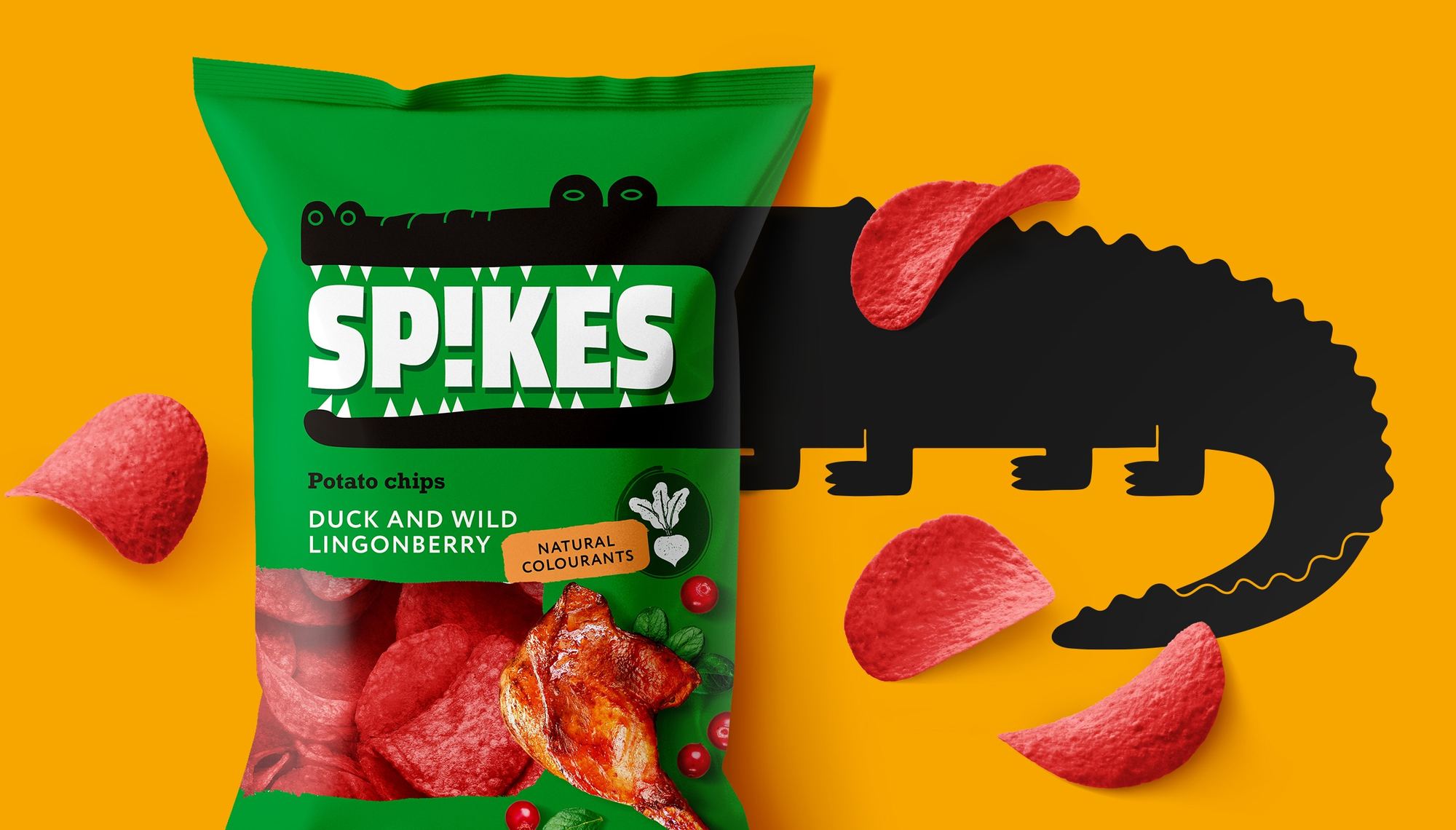
The core challenge was introducing a brand that could stand out on crowded supermarket shelves and online marketplaces. Spikes needed a cohesive strategy, identity, and packaging system built around naturally colored chips and unconventional flavor profiles—duck with lingonberry sauce, balsamic vinegar, and jalapeño cheese, without relying on artificial gimmicks.
Building a high-impact brand universe rooted in sensory surprise and playful character design.
To launch Spikes from the ground up, Mildberry translated consumer insights into a bold brand platform, dynamic name, vibrant visual identity, and scalable hero character.
We created a brand platform that expanded the venture beyond a standard restaurant model into a multifunctional cultural ecosystem. Anchored at the intersection of gastronomy, art, and media, the strategy established a foundation for a space designed to accommodate everything from weekday lunches to private events and creative salons.
We developed the name "Spikes" to mirror the satisfying crunch of the product while subtly signaling its sharp, spicy flavor profiles. Positioned as a loud manifesto of color and taste, the brand speaks directly to open-minded flavor seekers looking for an adventurous alternative to traditional snacks.
To anchor the visual identity, we created Spikesy—a charismatic, toothy crocodile with a bold character who always plays by his own rules. Spikesy serves as the centerpiece on the packaging and anchors the entire graphic system, providing a flexible foundation for digital communications, merchandise, and promotional materials. This integrated brand framework successfully turned a product innovation into an unmissable, highly distinctive retail presence.
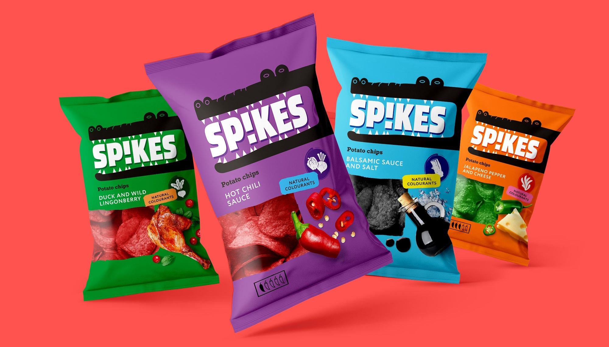
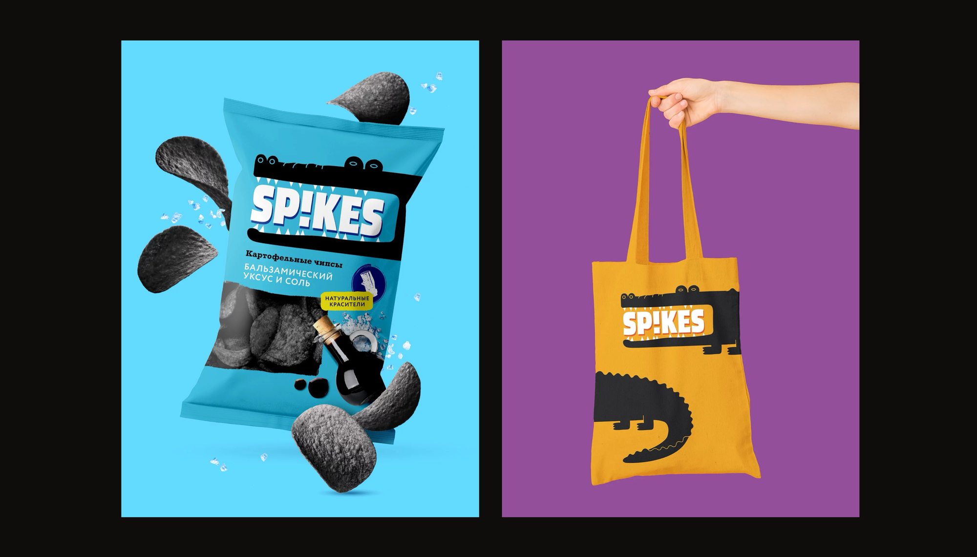
A standout snack brand that disrupts store shelves and elevates everyday snacking into a sensory event.
Spikes successfully carved out a distinct niche in the mature chip market by daring to be different. Mildberry brought the brand to life with a seamless blend of strategic positioning, expressive character design, and vibrant packaging that commands immediate attention.
By aligning visual impact with high-concept flavors, Spikes established a memorable brand identity that resonates with open-minded consumers. The brand stands ready to expand across both physical retail and digital marketplaces as a fresh, playful category contender.