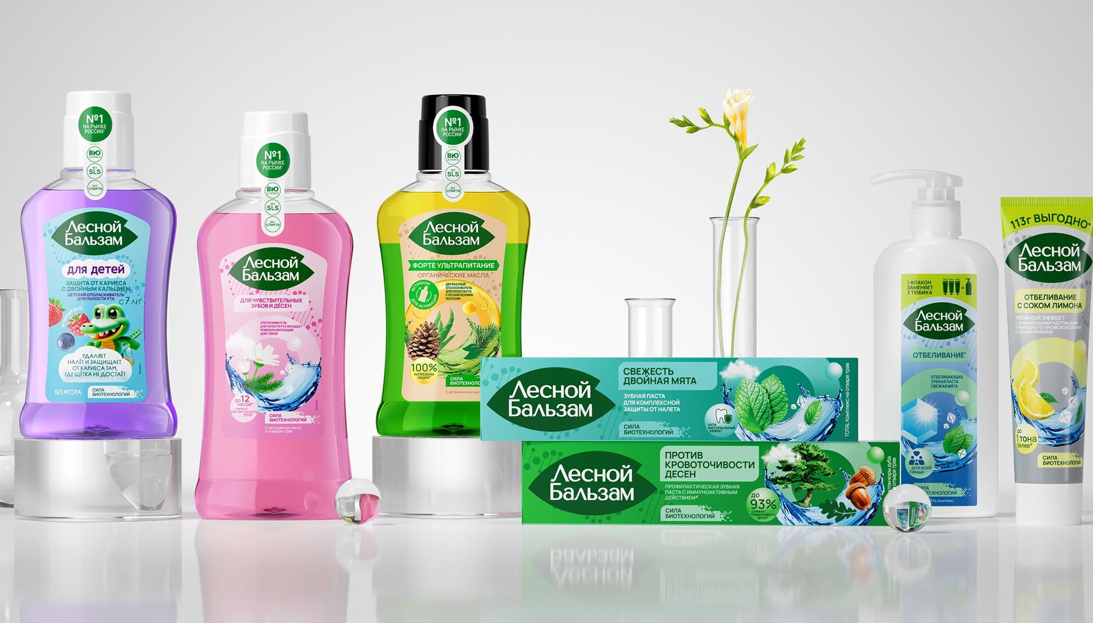
Rebooting a leading oral care brand through a biotechnology-led strategy, modernized design system, and structured portfolio architecture.
Rejuvenating a market-leading oral care brand to counter aging perceptions, professional brand competition, and portfolio fragmentation.
As global oral care trends shifted from basic hygiene toward professional care, natural ingredients, and complex daily routines, Lesnoy Balsam—owned by Arnest UniRus—faced critical growth hurdles. Despite holding top market positions in oral rinses and toothpastes, the brand’s growth was hindered by an outdated "old-school" packaging design, category stagnation in toothpastes, weak differentiation in the daily-care segment, and an overly narrow perception as strictly a gum-treatment product.
To reignite category growth, Lesnoy Balsam partnered with Mildberry for a complete brand relaunch. The strategic objectives were fourfold: reinforce functional efficacy through a modern narrative, broaden appeal to middle-aged consumers without alienating the loyal older core, scale the high-volume daily-care line, and logically structure the complex 55+ SKU portfolio around specific consumer pain points. Additionally, the project required restoring a key historical brand code that had been lost over time—the foundational concept of the forest and nature embedded in its name.
Developing a dual-nature brand positioning, a unified "Biotechnology Ring" visual asset, portfolio architecture, and key visuals.
Mildberry worked across strategic and visual levels to modernize the brand while reconnecting with its natural roots.
We repositioned the brand around "the power of biotechnology," bridging natural herbal care with scientific efficacy. Under the core promise "Biotechnology guarding your teeth and gums," the strategy emphasized clinically proven results and high concentrations of botanical extracts, re-establishing the brand's core forest heritage within a modern scientific context.
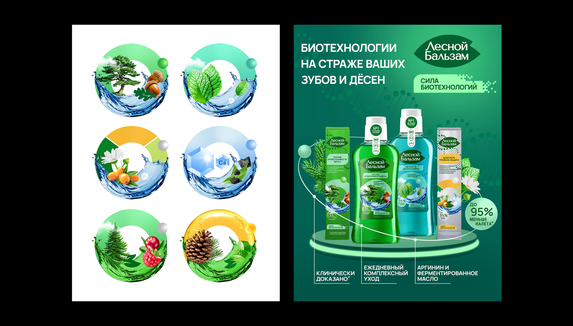
We designed a central visual element, the "Ring of Biotechnology", split between a technological flow and natural forest imagery. This icon served as the primary graphic bridge across packaging, establishing a consistent brand code for multi-year ATL, BTL, and digital marketing campaigns.
We tailored the packaging design through consumer testing to resonate across different target groups. The design maintained familiar cues for older, value-focused toothpaste buyers (45+) while elevating quality perception for younger, daily-care rinse users (30+).
We streamlined the complex product portfolio into an intuitive design system. By applying distinct visual treatments for different oral health needs and product tiers, the new architecture improved shelf navigation, helped the brand "block" retail shelves, and encouraged cross-category trial between toothpastes and rinses.
We developed comprehensive key visuals and a master brandbook detailing rules for packaging variants, media channels, and digital touchpoints. This scalable framework lowered future rollout costs and ensured seamless integration for upcoming product innovations.
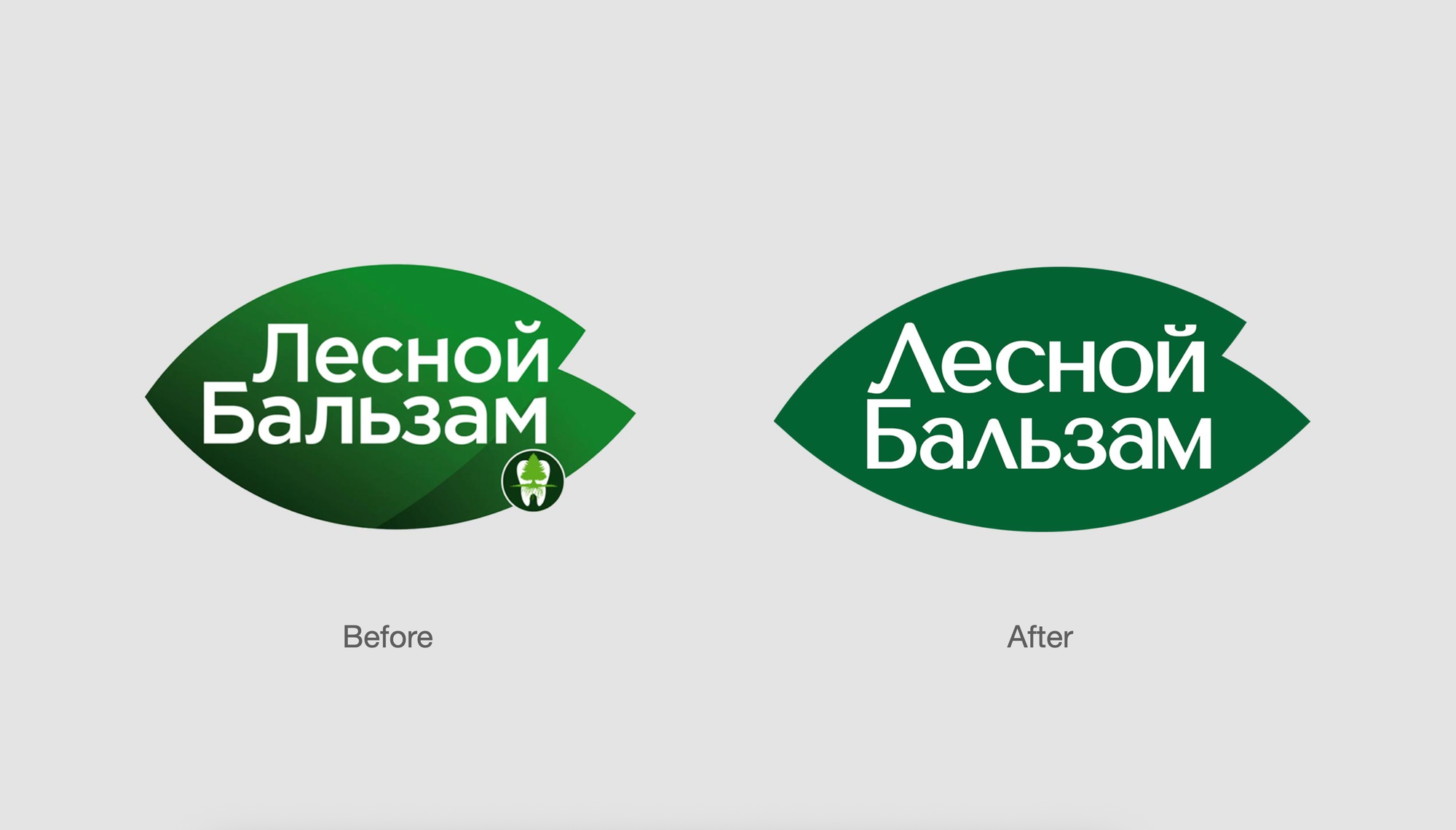
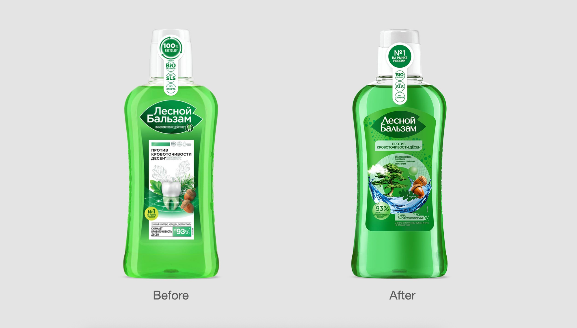
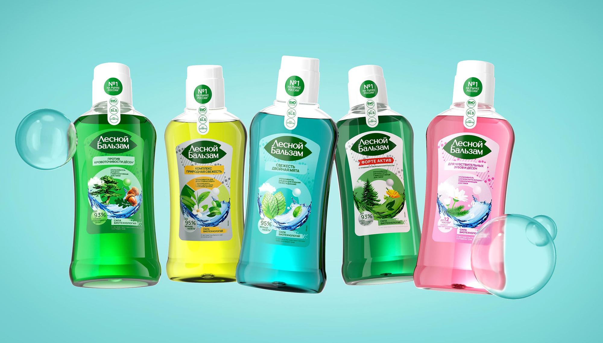
A unified, modern brand platform that restored shelf impact and laid the foundation for nationwide expansion.
Mildberry delivered a complete design system and strategic architecture that clarified Lesnoy Balsam’s 55+ SKU portfolio. By successfully balancing natural legacy with biotech innovation, the relaunch strengthened brand equity, improved shelf navigation, and positioned the brand for sustained leadership across both retail and e-commerce channels.
"For us as a category leader, this is not just a brand refresh—it is an important step in the development of the oral care industry."
