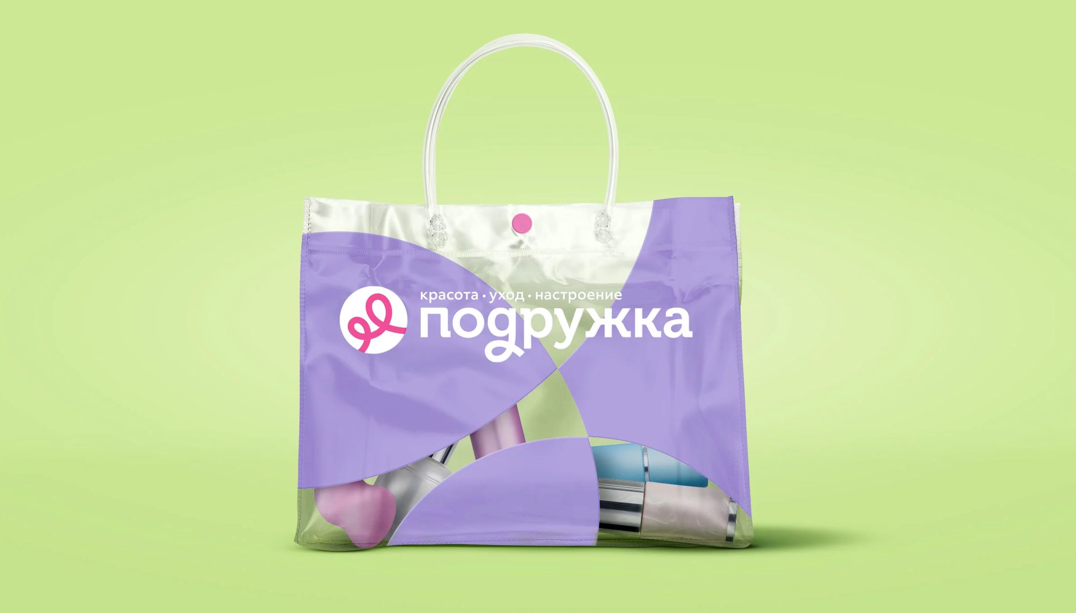
Transforming a beauty retailer through an easy, emotionally engaging omnichannel shopping experience.
Restoring relevance in a beauty retail market reshaped by marketplaces
Founded in 2005, Podruzhka had grown into a major Russian beauty retail network, with more than 500 stores across 85 cities. By 2022, however, the business faced a changed market reality: marketplaces were intensifying competition through broader choice, lower prices, and seamless logistics, while the gap between value-led drugstores and premium service retailers was becoming increasingly pronounced.
Podruzhka’s existing brand no longer fully resonated with contemporary beauty consumers or made the most of emerging omnichannel opportunities. The business needed more than a visual refresh. It required a full brand transformation that could support rapid regional growth, broaden its audience, create a seamless phygital customer journey, and enable more relevant, segmented communication across the customer lifecycle. The opportunity lay in the space marketplaces could not easily own: a convenient, emotionally rewarding beauty-shopping experience that feels personal, inspiring, and enjoyable both online and offline.
Building an everyday beauty brand that feels close, helpful, and easy to choose
Mildberry partnered with Podruzhka on a full-scale rebrand, developing its brand strategy and platform, visual identity, tagline and descriptor, communication framework, recommendations for the retail concept, and assortment strategy. The work repositioned Podruzhka from a conventional cosmetics retailer into an approachable everyday beauty companion.
We defined Podruzhka’s new strategic focus as effortless, everyday beauty shopping. The brand was positioned as a friendly, accessible helper that brings beauty and joy into women’s everyday lives, making it easier to care for themselves, their loved ones, and their homes with confidence and taste. The platform is built around four core values: beauty for everyone, attentiveness, friendly relationships, and respect for individuality. Podruzhka’s role is not simply to sell beauty products, but to make self-care feel lighter, more enjoyable, and more attainable. The new tagline, “Beauty Made Easy,” captures this promise: easy shopping, everyday inspiration, practical convenience, and the simple pleasure of taking care of yourself.
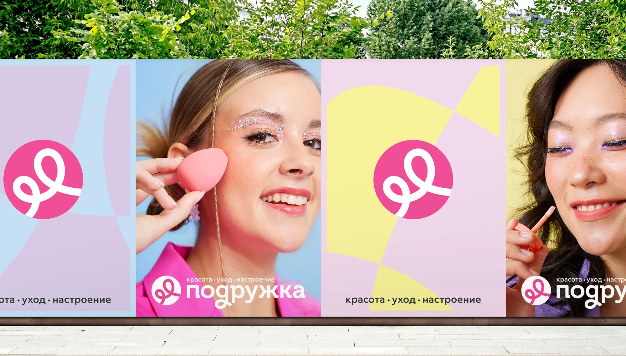
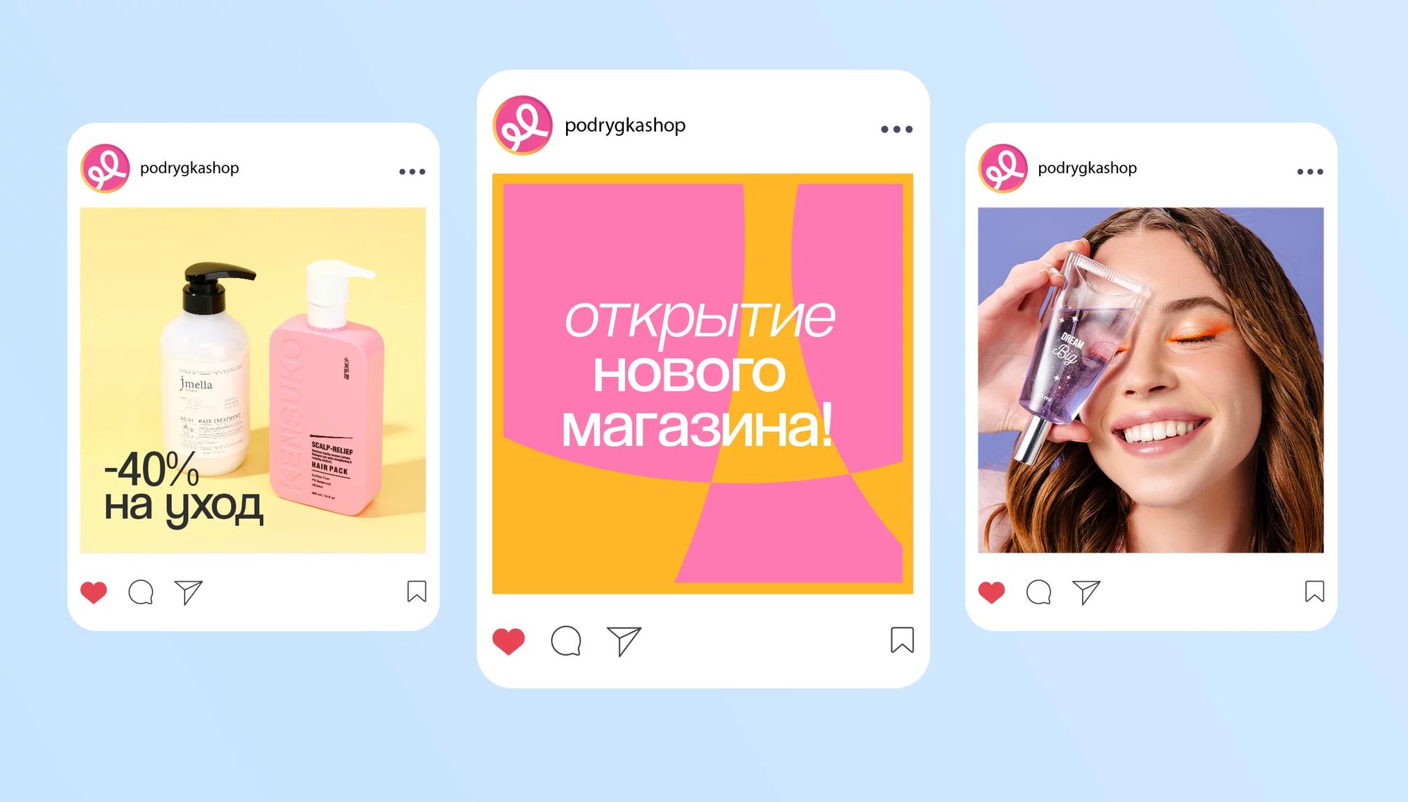
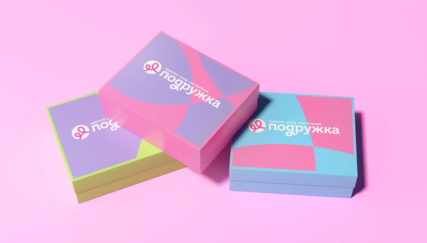
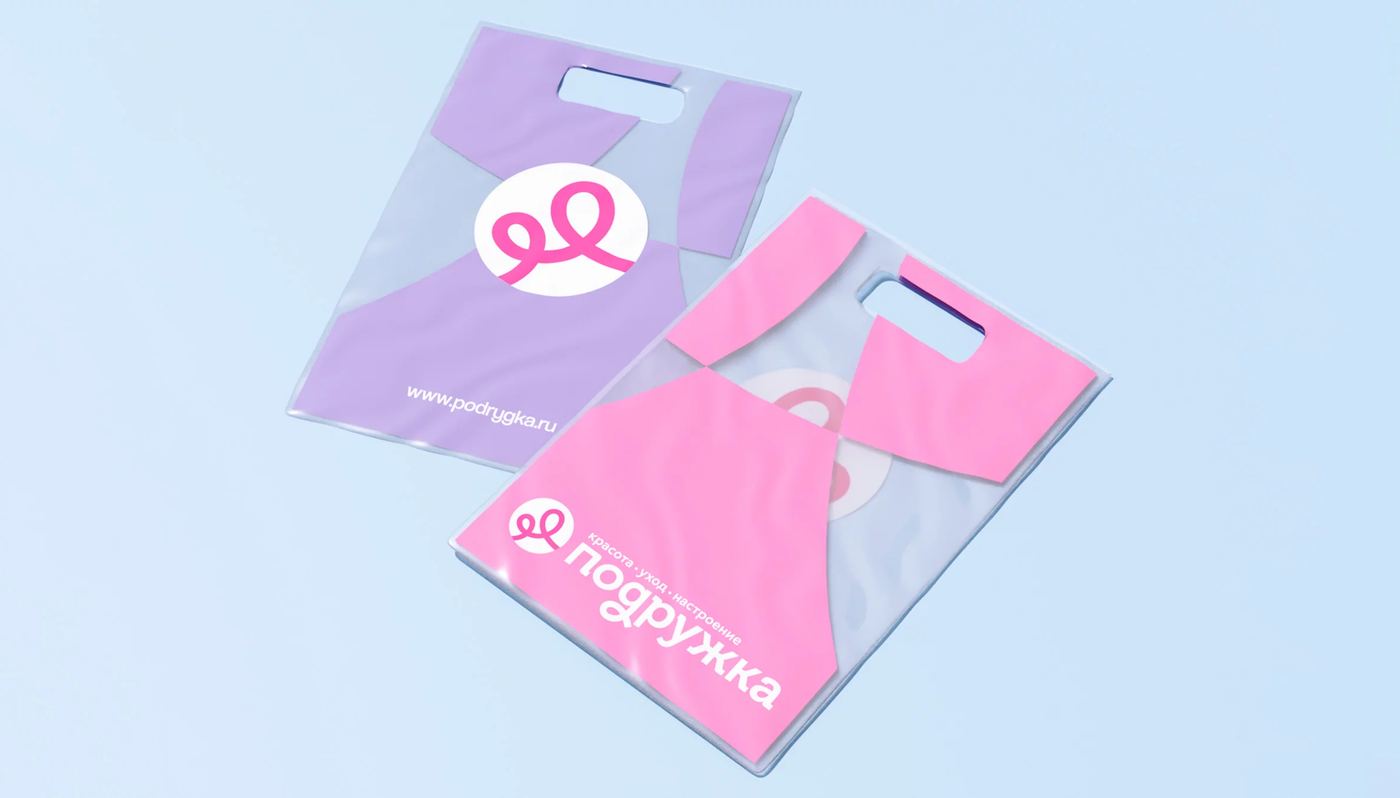
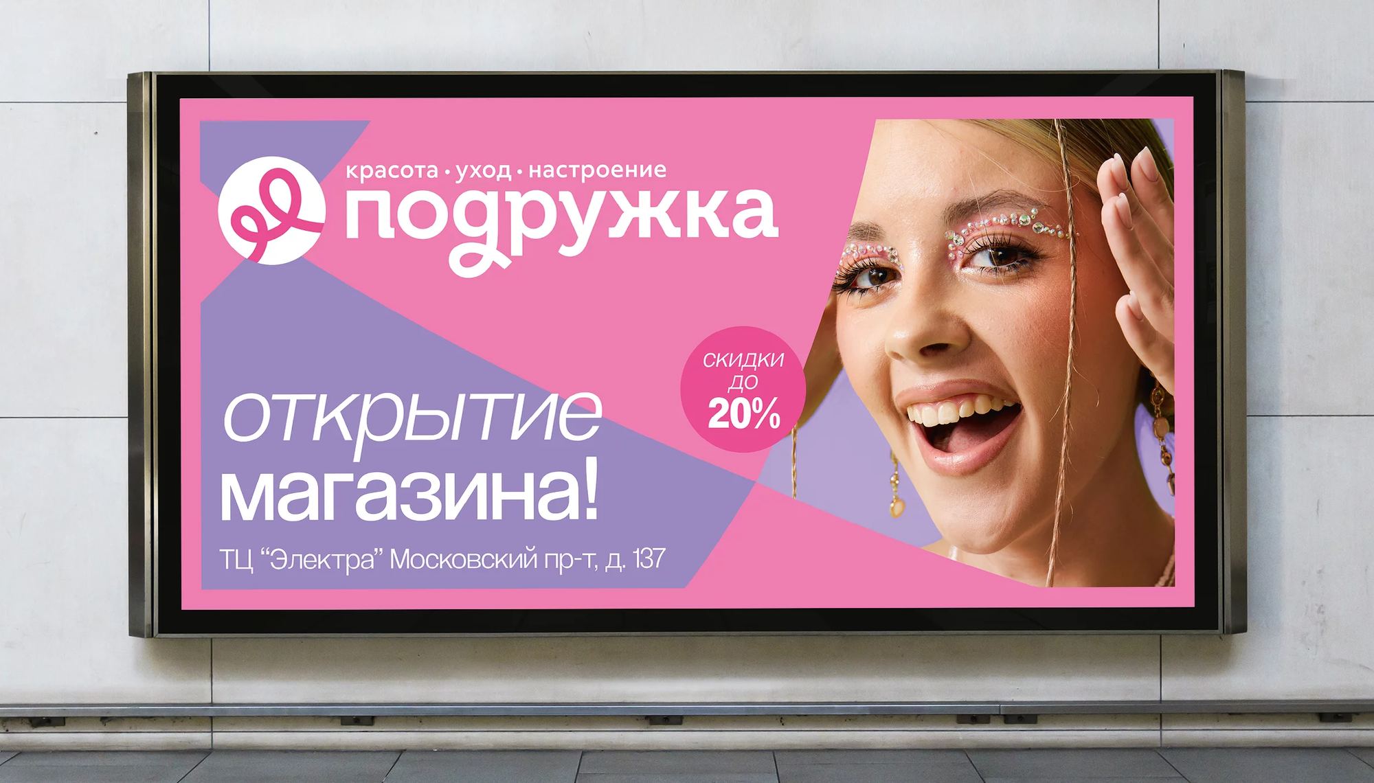
To bring the new brand role to life, we created a visual identity that balances familiarity with a more contemporary and emotionally open expression. The refreshed wordmark retains subtle cues from Podruzhka’s previous lettering, preserving brand recognition while giving it a friendlier and more flexible character. A round bow symbol became the core of the identity. Its flowing ribbon expresses beauty and ease, while its two loops represent friendship and the relationship between the brand and its customers. The wider design system was created to work seamlessly across physical and digital environments. A soft pastel palette, dynamic graphic elements derived from the intersections of the symbol’s lines, and a photographic style focused on naturalness and positive emotion give Podruzhka a consistent, recognizable presence across stores, communications, and the app.
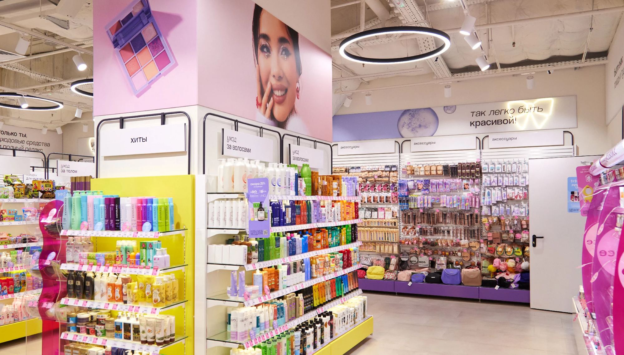
We developed recommendations for a new retail concept designed to translate the brand’s friendliness into a tangible customer experience. The recommendations set out principles for bright beauty spaces with expressive accents, engaging navigation, and subtle sensory branding. The proposed retail environment is built around the metaphor of a Sunday morning: soft, diffused light, pastel interiors, and lightweight transparent forms in promotional displays create an atmosphere that feels calm, uplifting, and inviting. Rather than treating the store as a purely functional point of purchase, the concept makes beauty shopping feel like a small everyday pleasure. Mildberry also developed a communication strategy, including a messaging system and recommendations for campaign assets, video, and social media. This ensured that Podruzhka’s new voice could remain consistent across all customer touchpoints.


A cohesive, modern phygital brand platform for seamless omnichannel engagement
Mildberry delivered a complete, scalable brand framework designed to support Podruzhka’s growth and strengthen its connection with contemporary beauty consumers. The refreshed visual identity, unified brand platform, communication system, and recommendations for the retail concept established a consistent experience across digital and physical touchpoints.Podruzhka has begun rolling out the new retail format, with a number of stores already opened under the updated concept. The first location launched in March 2024, establishing a physical expression of the new brand experience.
Stores
Cities
SKUs